

The world’s most popular framework for building responsive, mobile-first sites, Bootstrap, has an inbuilt Modal and it’s damn pretty. Well, no so pretty. We’ve seen a couple of developers using it as is; which is fine. But even better is this little snippet that’s already customized to make every modal stand out well.
Let’s get started.
Below is how the standard Bootstrap 4 looks like when included by default into a webpage.
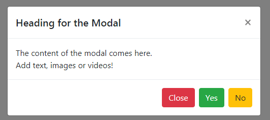
Now we are going to make this better.
Start with the HTML below.
<!-- Button trigger modal -->
<button type="button" class="btn btn-primary" data-toggle="modal" data-target="#atdModal">
  Launch Busystory demo modal
</button>

<!-- Modal -->
<div class="modal fade" id="atdModal" tabindex="-1" role="dialog" aria-labelledby="atdModalTitle" aria-hidden="true">
  <div class="modal-dialog modal-dialog-centered" role="document">
    <div class="modal-content p-3">
      <div class="modal-body">
        <button type="button" class="close" data-dismiss="modal" aria-label="Close">
          <span aria-hidden="true">×</span>
        </button>

        <div class="d-flex">
          <img height="42px" src="https://busystory.com/wp-content/uploads/2023/03/busystory-favicon.png" />
          <div class="ml-2">
            <h6 class="mb-0">Busystory</h6>
            <p>all top devs</p>
          </div>
        </div>
        <div>
          <p>Busystory is a hub for top & aspiring top developers to share their passion for building incredible Internet things. Busystory is for web professionals, by top web professionals.</p>
        </div>

        <hr />

        <form>
          <div class="form-group">
            <label for="exampleInputEmail1">Full Name</label>
            <input type="text" class="form-control" id="" aria-describedby="" placeholder="Busystory">
          </div>
          <div class="form-group">
            <label for="exampleInputEmail1">Email address</label>
            <input type="email" class="form-control" id="exampleInputEmail1" aria-describedby="emailHelp" placeholder="info@busystory.com">
            <small id="emailHelp" class="form-text text-muted">We'll never share your email with anyone else.</small>
          </div>
          <div class="form-group">
            <label for="exampleInputEmail1">Mobile Number</label>
            <input type="text" class="form-control" id="" aria-describedby="" placeholder="+124321098">
          </div>
          <div class="mb-3"><button type="submit" class="btn btn-primary btn-lg w-100">Let's go</button></div>
        </form>

      </div>
      <div class="modal-footer small">
        ©2023. Busystory
      </div>
    </div>
  </div>
</div>
Let’s spice it up with this CSS
<!-- Styling -->
<style>
  #atdModal {}
  #atdModal .modal-content {
    border:0;
    border-top:10px solid #362c57;
    background:#eff6fd;
  }
  #atdModal label {
    font-size: 90%;
    color: #999;
    margin-bottom:0;
  }
  #atdModal .form-control {
    background:#ebf1f7;
    border:0;
    border-bottom:1px solid #e4e4e4;
    box-shadow:2px 2px 2px #e4e4e4;
    padding:20px; height:50px;
  }
  #atdModal .btn-primary {
    background:#362c57;;
    border-color:#362c57;;
  }
</style>
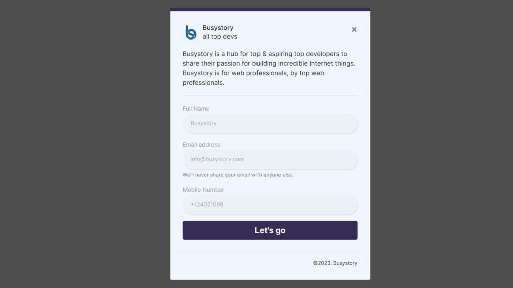
And this is our final result
NB: Don’t forget to include the base bootstrap files:
<link rel="stylesheet" href="https://stackpath.bootstrapcdn.com/bootstrap/4.3.1/css/bootstrap.min.css" />

<script src="https://code.jquery.com/jquery-3.3.1.slim.min.js"></script>
<script src="https://cdnjs.cloudflare.com/ajax/libs/popper.js/1.14.7/umd/popper.min.js"></script>
<script src="https://stackpath.bootstrapcdn.com/bootstrap/4.3.1/js/bootstrap.min.js"></script>