Making the lives of users easier is something I’m very passionate about and this article is a direct result of that. As designers, understanding Hick’s Law means we can design products that will attract and retain more users. Designing products with a good user experience requires that we understand our users’ problems, find ways to help them, and guide them to the specific functions they need most. If our users get stuck in the decision-making process of ‘what next?’, they may end up confused, frustrated, or even leave our website entirely (and never come back).
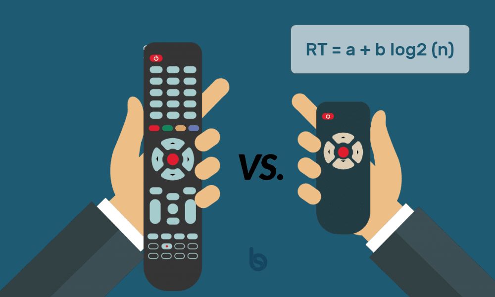
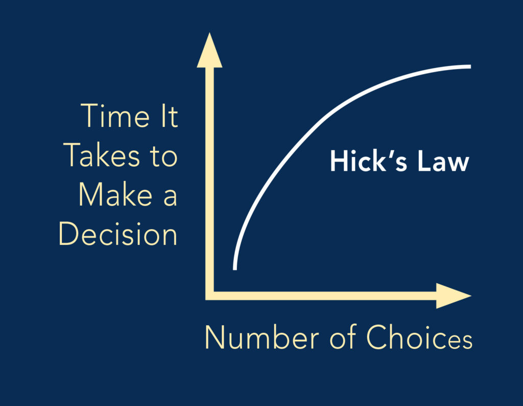
Hick’s Law is a psychological principle that states that the time it takes to make a decision increases with the number and complexity of choices. Simply put, the more choices you present your users with, the longer it will take them to reach a decision.
Hick’s Law feels like common sense but it is often neglected by both designers and product managers in the rush to add too many features to an app or site. In our daily duties as designers, we will use Hick’s Law to examine how many functions to offer at any part of our products and how this will affect our users’ overall approach to decision-making.
Sometimes, there’s no avoiding complexity, especially if we’re involved with presenting a huge amount of needed information about advanced products or complex services. Using Hick’s Law can help us reduce that complexity by simplifying the decision-making process for our users. The objective of Hick’s Law is to try and simplify the decision-making process, not eliminate that process entirely.
To make our designs work, we need to remember that the user’s time is precious, and a user is not obligated to stay on our site. To enhance the user experience, we should consider the following:
- Simplify choices for the user by breaking down complex tasks into smaller steps.
- Avoid overwhelming users by highlighting the recommended options.
- Use progressive onboarding to minimize cognitive load for new users.
How to apply it
If there are complex options in your mobile app or website which could overwhelm your users then simply hide them for power users and edge cases. Take computer settings, for example. Many options are available to users in a general panel and these options will usually satisfy the vast majority of people. But for more technical options, you’ll usually come across an “advanced settings” button. This is one way of hiding features without totally removing them.
Takeaway
Overall, remember that Hick’s Law is a guideline you can adapt to your design. Always try to flip the perspective to see the choices you want to present from the outside. Avoid flooding the users with options, but bear in mind the balance between the users’ time and comfort zones for handling options on a page. Guiding them to select between clear options that will get them somewhere quickly (such as a shopping cart or a checkout page) will take the work out of the user experience and reward you both.